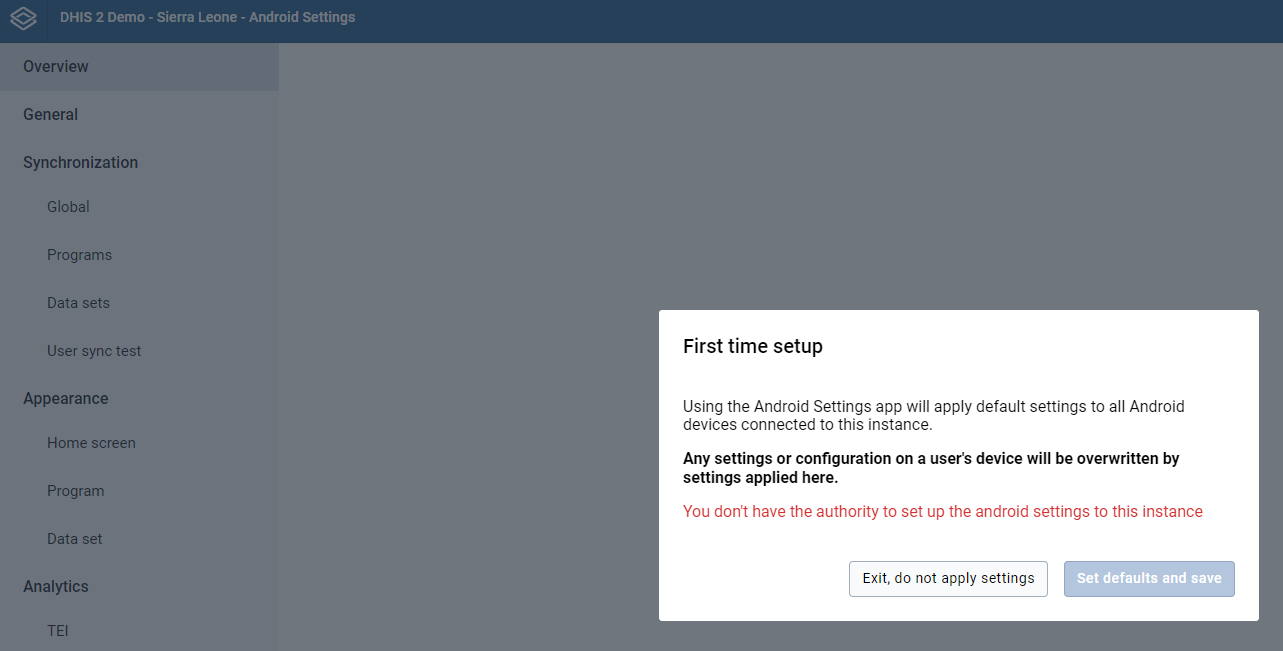
I have an instance running on 2.36. I am experiencing issues finding visualizations when using the Android settings app for analytics even though I have visualizations setup with all the right sharing permissions.
Could you please assist with what other configurations I might be missing for the visualizations to be visible to the app?
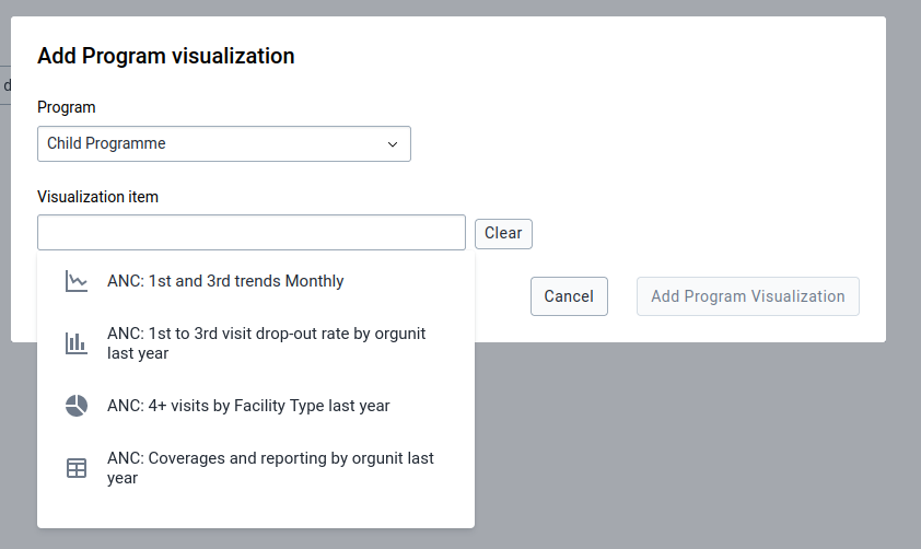
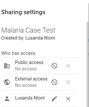
I configured a visualization as a chart as specified with the “view and edit” sharing settings for both the visualizer and dashboard.
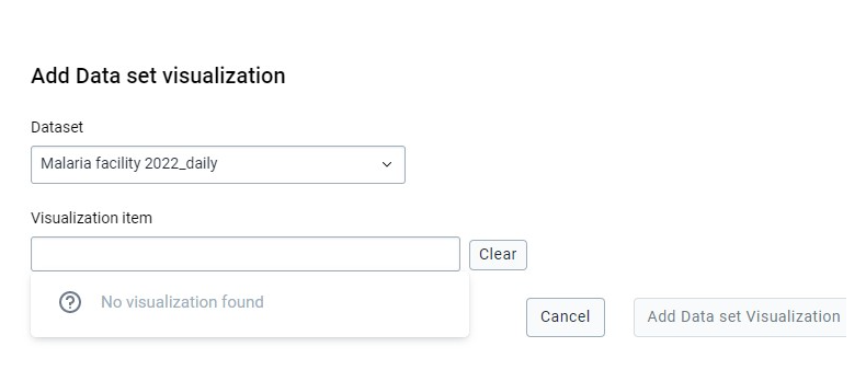
I’m still unable to see the visualization for Data set visualization on the android web app even though I have allocated all authorities to my user login.
I have attached some screenshots for your further perusal.
Please revert back to me on what else could be factors that the visualizations are not visible to the web app.
(1) I currently face the same issue [cannot see all created visualizations] and unfortunately the solution was not posted. Would you mind telling us the solution in few words?
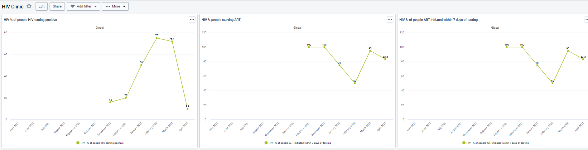
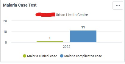
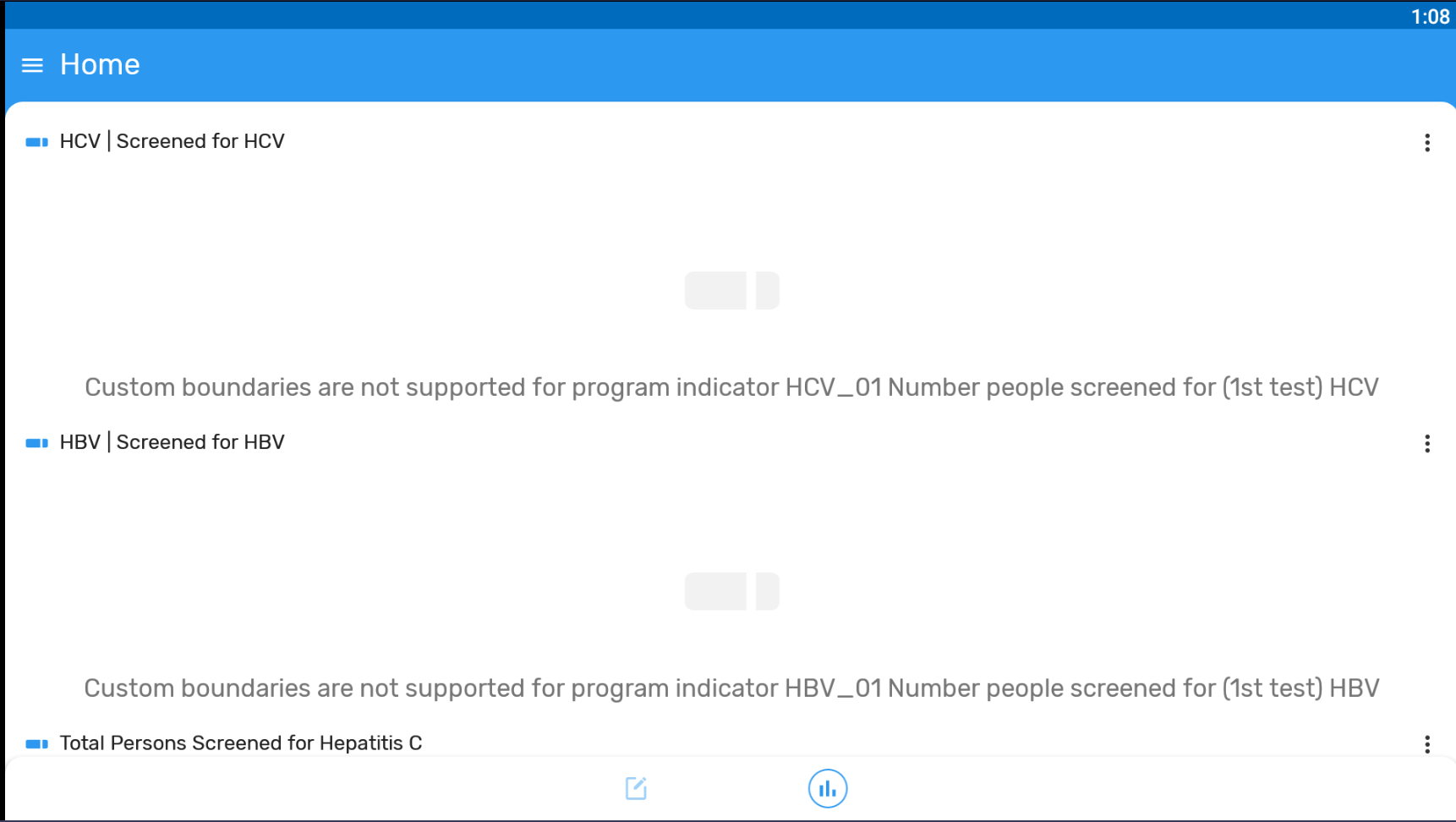
(2) For program indicators, I cannot see charts. [Please see the Screenshot]
Regarding the second part of the question, the reason why those charts are not displayed is that custom boundaries are not supported in the app yet. They are in the roadmap and they are likely to be added in the next version.
Currently, the app only supports the default boundaries, that is, the boundaries that are created by default when creating a new program indicator. It means:
There wasn’t a configuration issue in Lusanda’s case. He wasn’t able to see the bottom bar (Analytic icon) because of the color of the program.
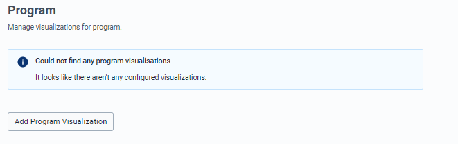
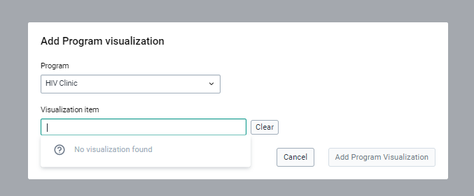
But if you are not able to see the visualizations listed (in the Android settings webapp) then check if your visualization meet the following criteria:
1. Visualization Type
Column, Line, Pie, Pivot Table, Single Value, Radar 2. Relative Periods
Today, yesterday, this week, this month, this year,
last 3, 7, 14, 30 days,
Last 4, 12 weeks,
Last 3, 6, 12 months 3. Row Dimensions
Max: 1 4. Column Dimensions
Max: 2 5. Organisation Units
Access to at least 1 org unit level (userOrgUnitChildren, userOrgUnitGrandChildren, userOrgUnit)
If the visualization is configured with fixed org units or periods (or unsupported charts), it won’t appear in the list. Let me know if this helps or if you have any other question. More information here: