Background
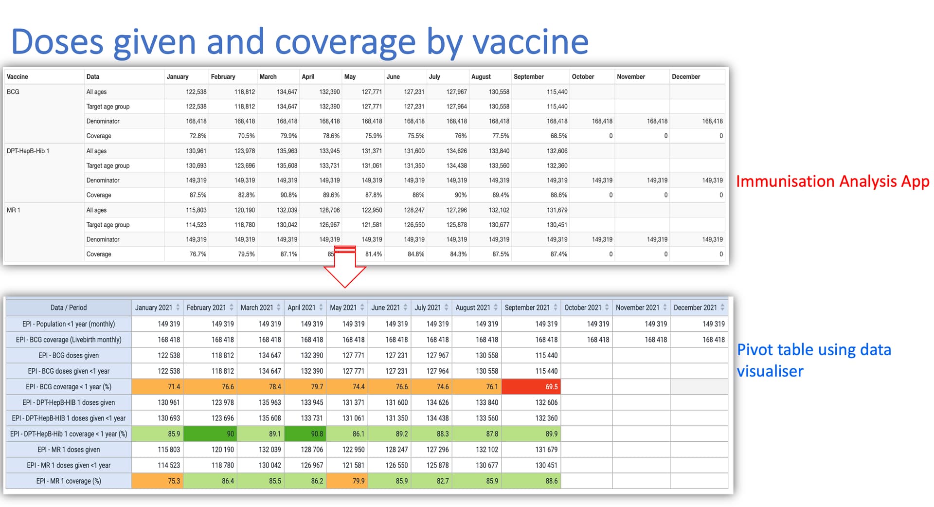
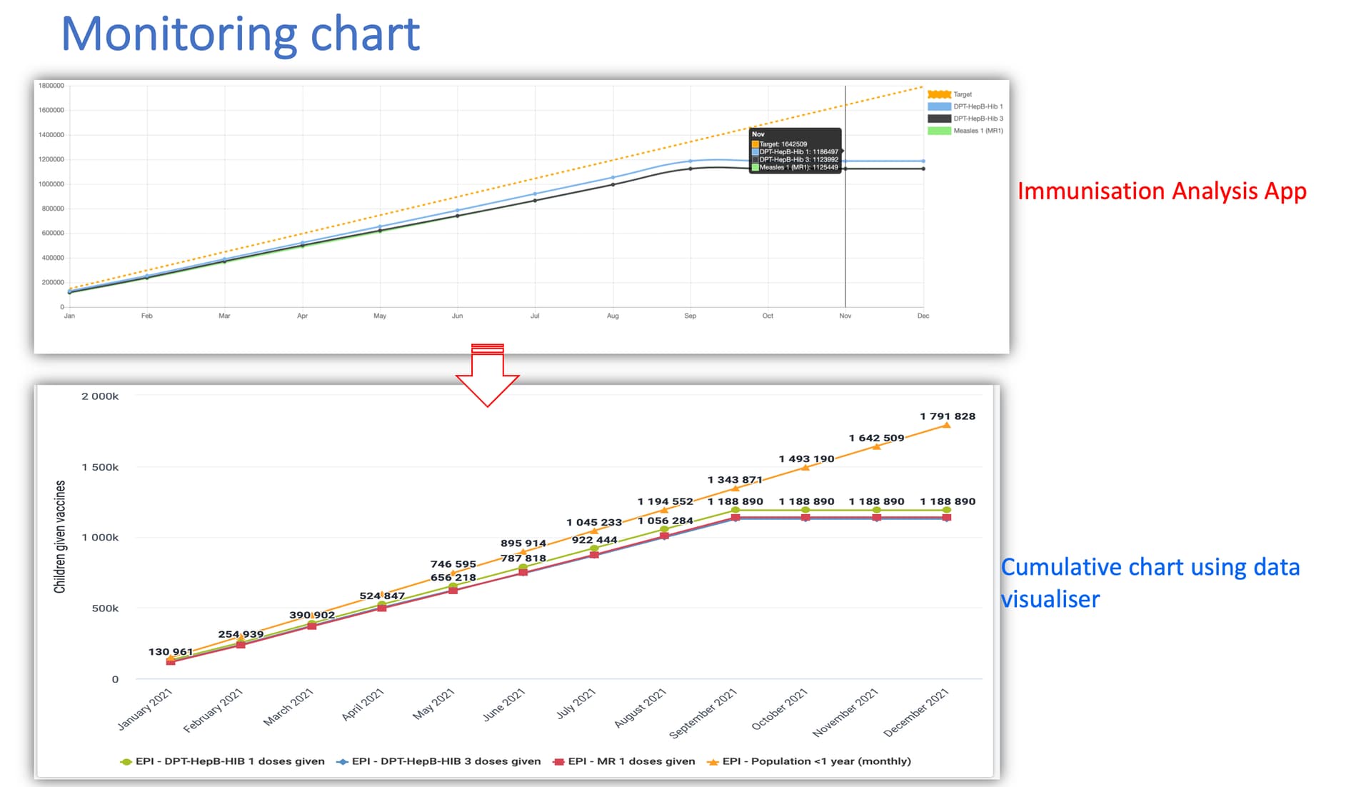
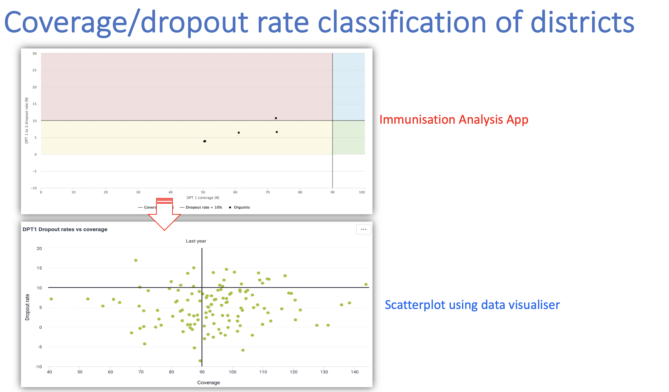
DHIS2 core analytic features have evolved over time and it should be able to meet most of the requirements that led to the development of some custom applications like immunization analysis applications. We recently created all of the analytic items of the immunization analysis app using the core DHIS2 features for the national data repository for Uganda MOH based on version 2.36. These included; the monitoring chart, categorization of the district based on coverage/dropout rate, and coverage by the vaccine given
Limitations
- Pivot table does not generate cumulate values like the charts therefore not able to create a table with cumulative values of children given vaccine on monthly basis.
- In the scatter plot, it is not possible to use colours to shade areas in the chart and visually classify districts based on their performance.
Here are the visualizations in core analytics in comparison with the app