Hi all, I want to create a spider diagram for displaying indicator values for before and after an intervention. Currently, I can generate them as separate diagrams (before and after), but what I want is a spider diagram that combines the two. see example (https://images.app.goo.gl/ZV3uQVgHpzz6uZNTA)
Hi @Fatsani
In the Data Visualizer app, one of the available charts is called “Radar chart,” so if you use that chart, you will be able to create a ‘spider diagram’.
Could you please share a screenshot from the DHIS2 app of what you currently have produced as separate diagram?
Thank you!
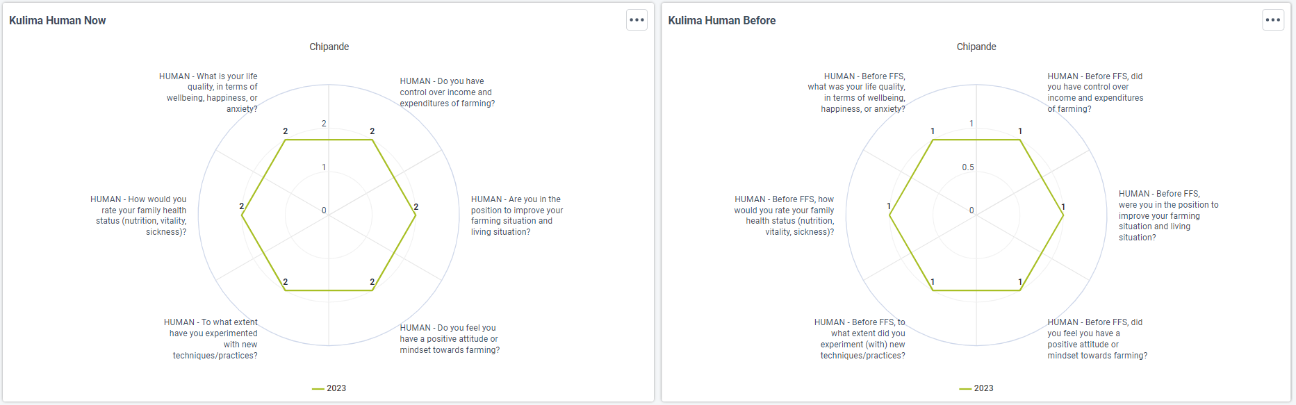
Hi @Gassim
Thank you for your quick response. Find the attached screenshot. The left chat shows results after an intervention, while the right chat shows results before an intervention. To represent a clear picture of whether there have been changes due to an implemented intervervention, the idea is to have these two as one.