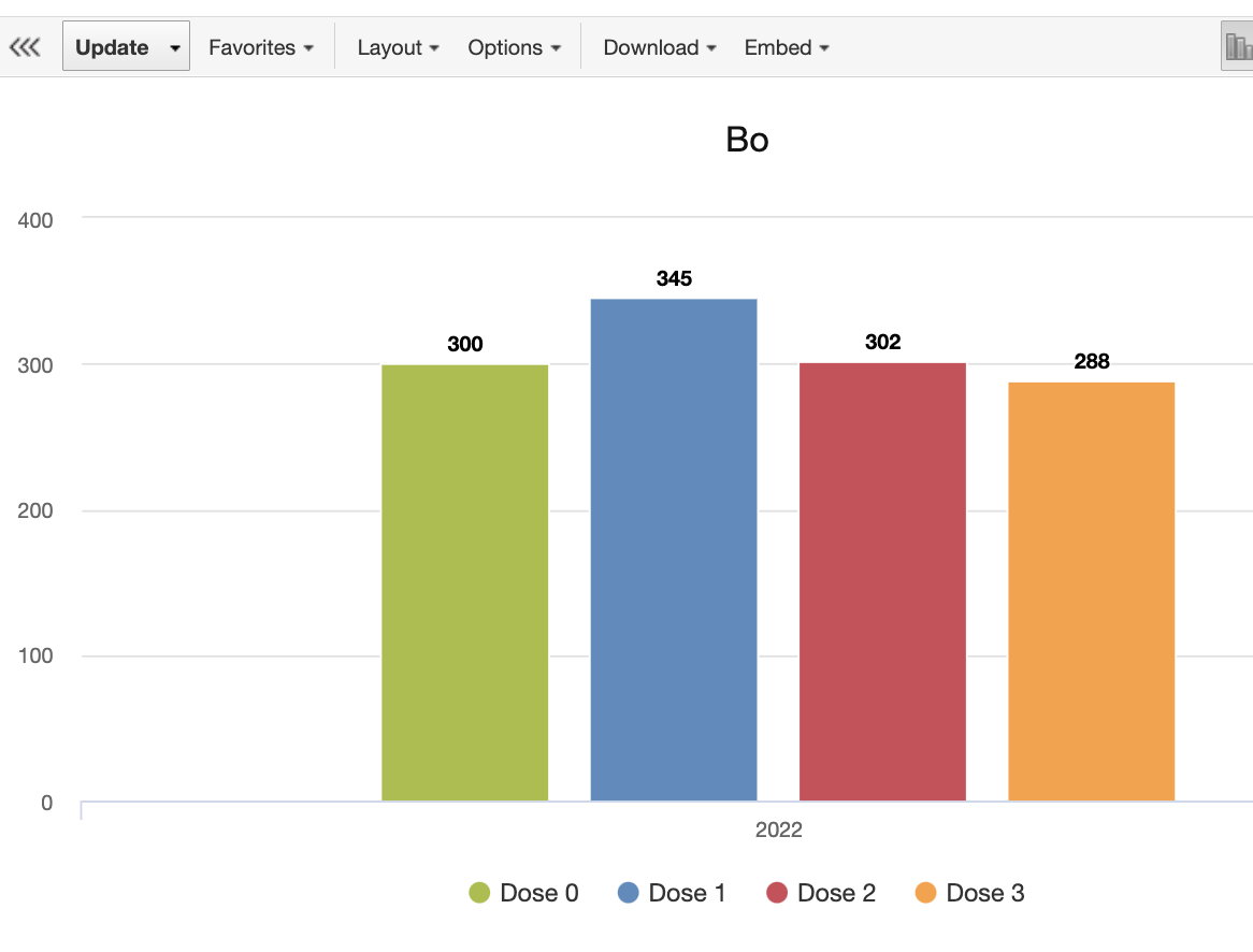
I found difference in counting the same value in Event visualiser and program indicator. Please compare the pictures above
Below I have attached json metadata for https://play.dhis2.org/2.36dev/ for demo purposes. And this is the version of DHIS2 where all the actions has been tested
Thank your for the detailed post! I believe you are testing in 2.36dev (what version is your live instance?) Did you try to run analytics export and clear the cache after testing?
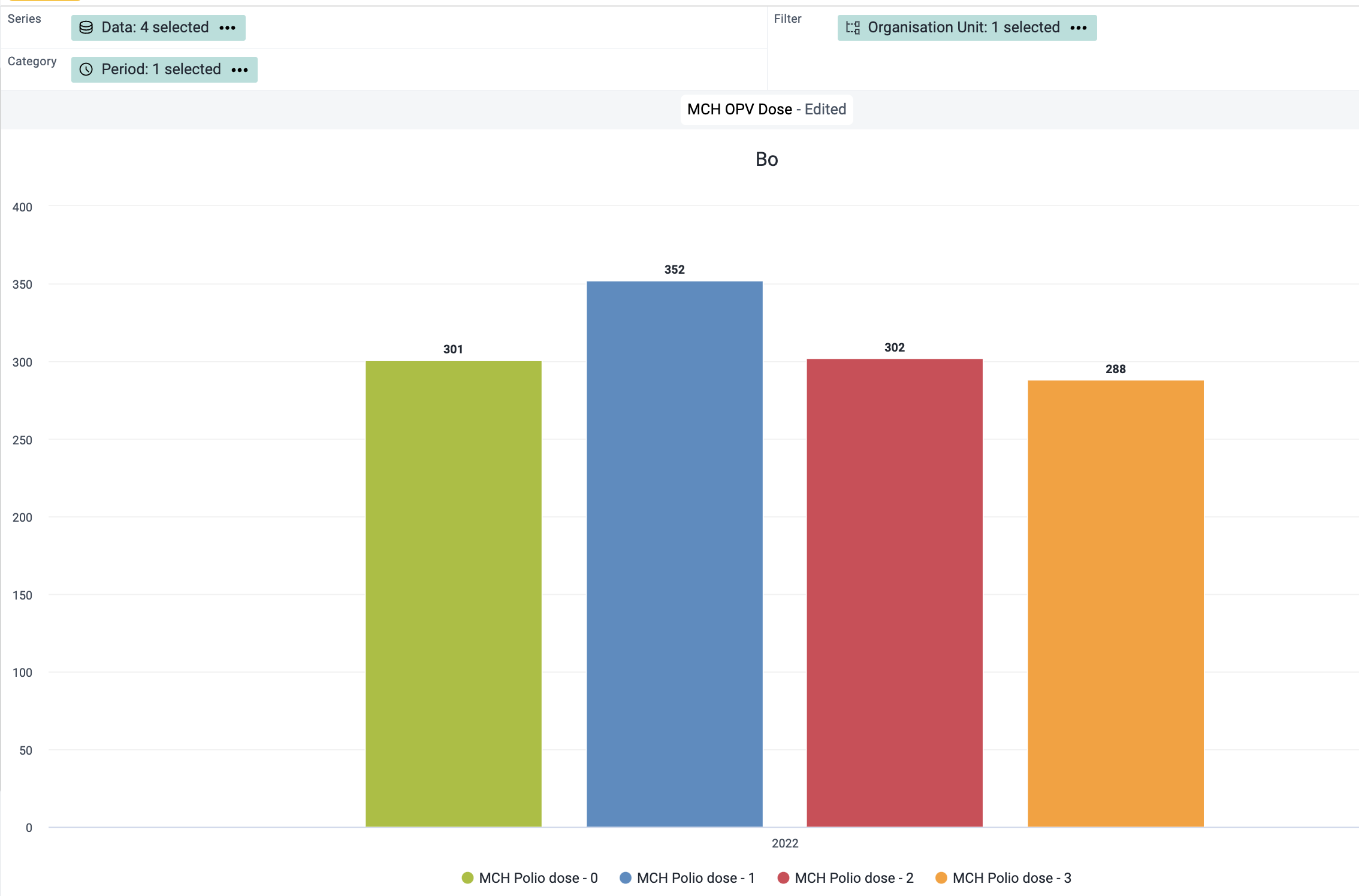
I tested in the Event Visualizer and it seems to work:
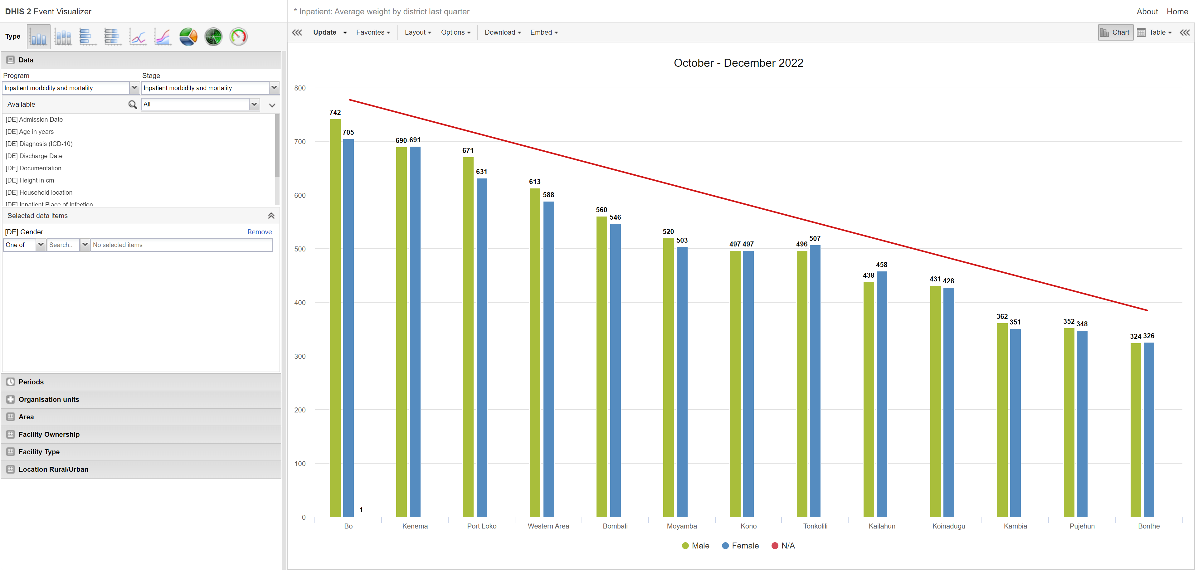
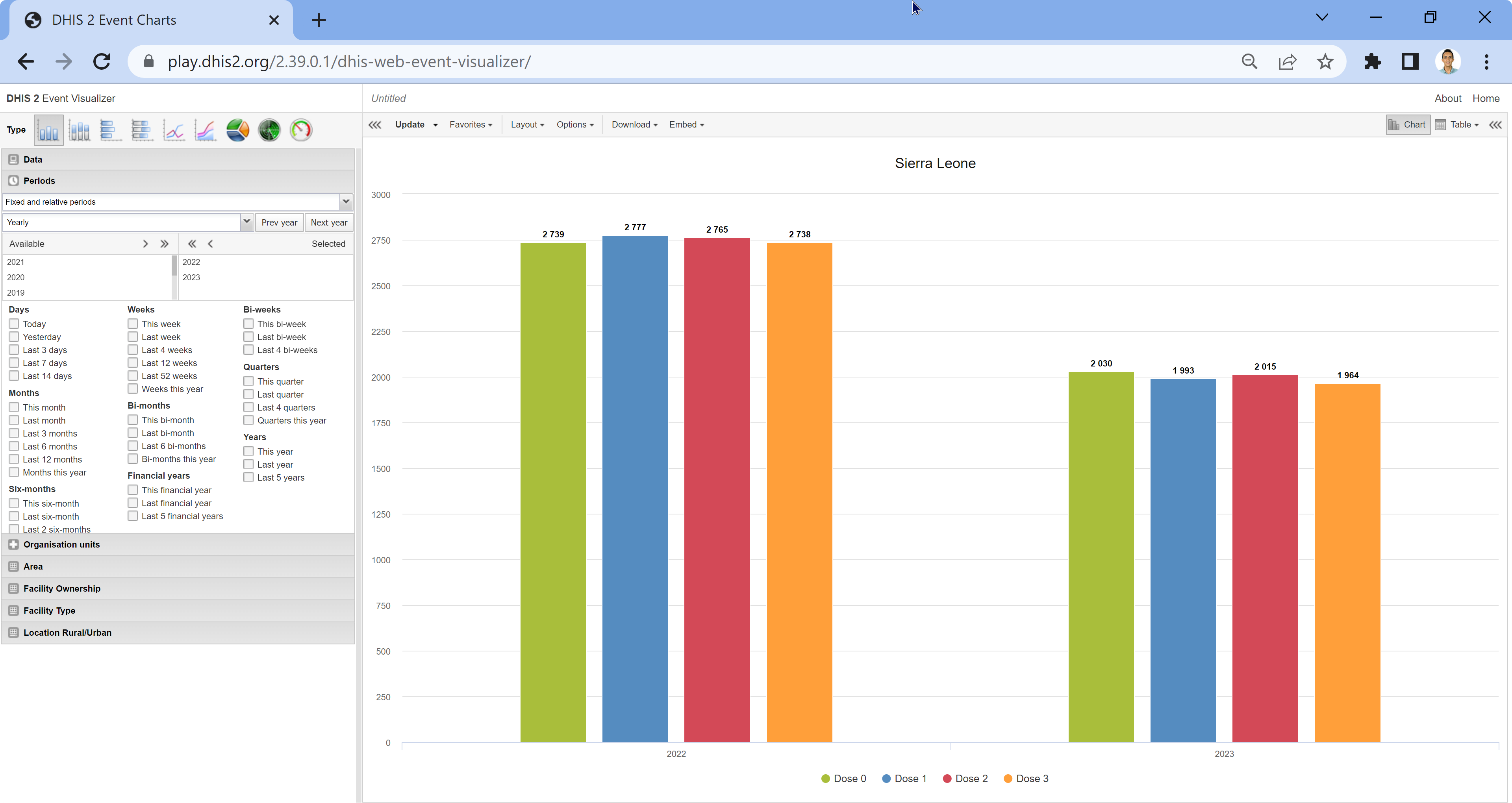
Maybe there’s a difference in understanding how the sorting is working? For example in the image below, it counted Tonkolili to be less than Kono even though it has in total nine more people than Kono!
Thank you for your reply.
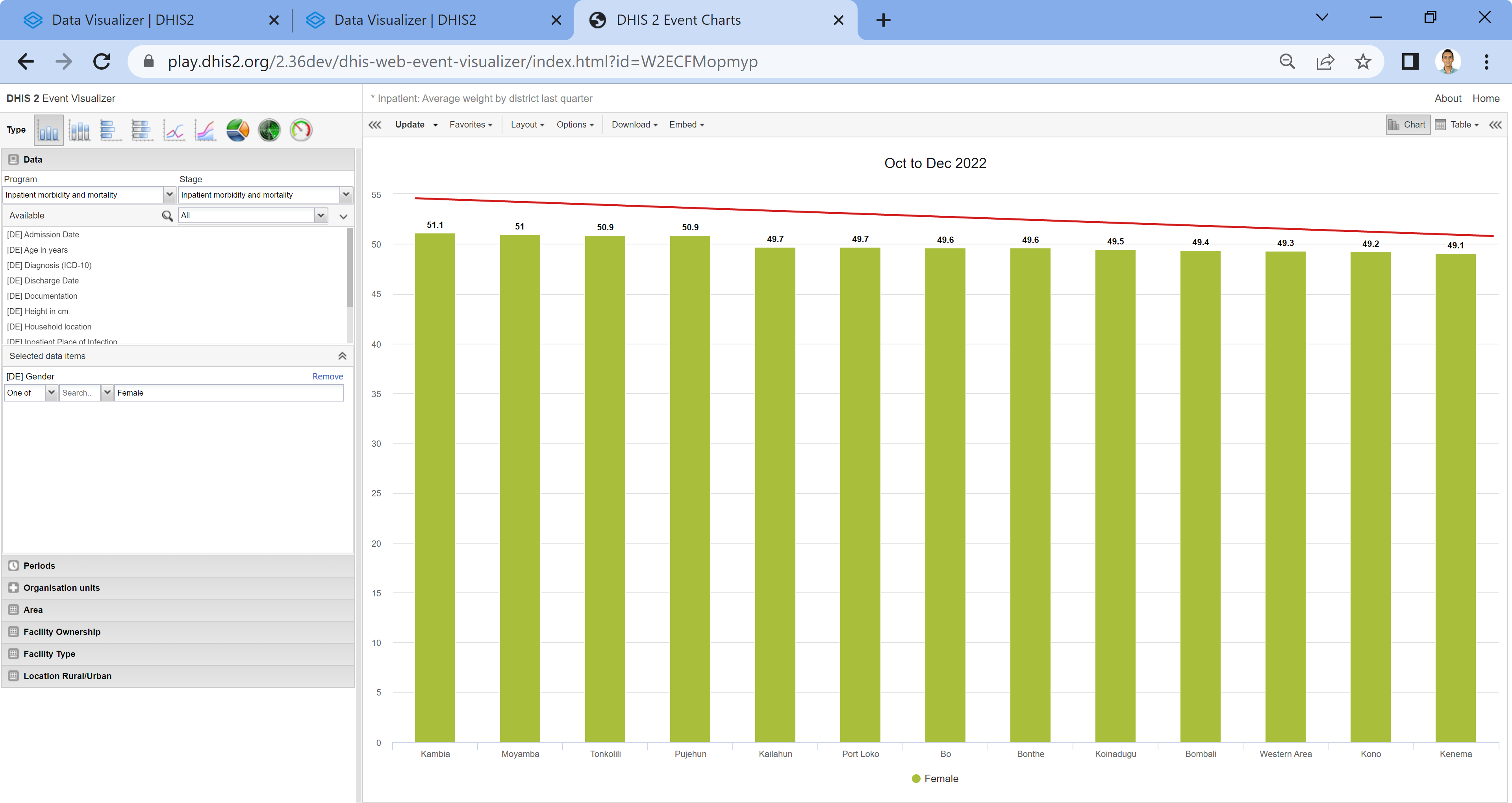
Could you please try to take only MCH OPV dose data element in Child programme and try to build sorted chart in Event visualiser? I am trying to sort values between the options, not between the OUs.
I am using dhis2.36.10
@Gassim, even if you will create program indicators it would not work. And additionally was surprised when there is differences in number of counting sometimes.
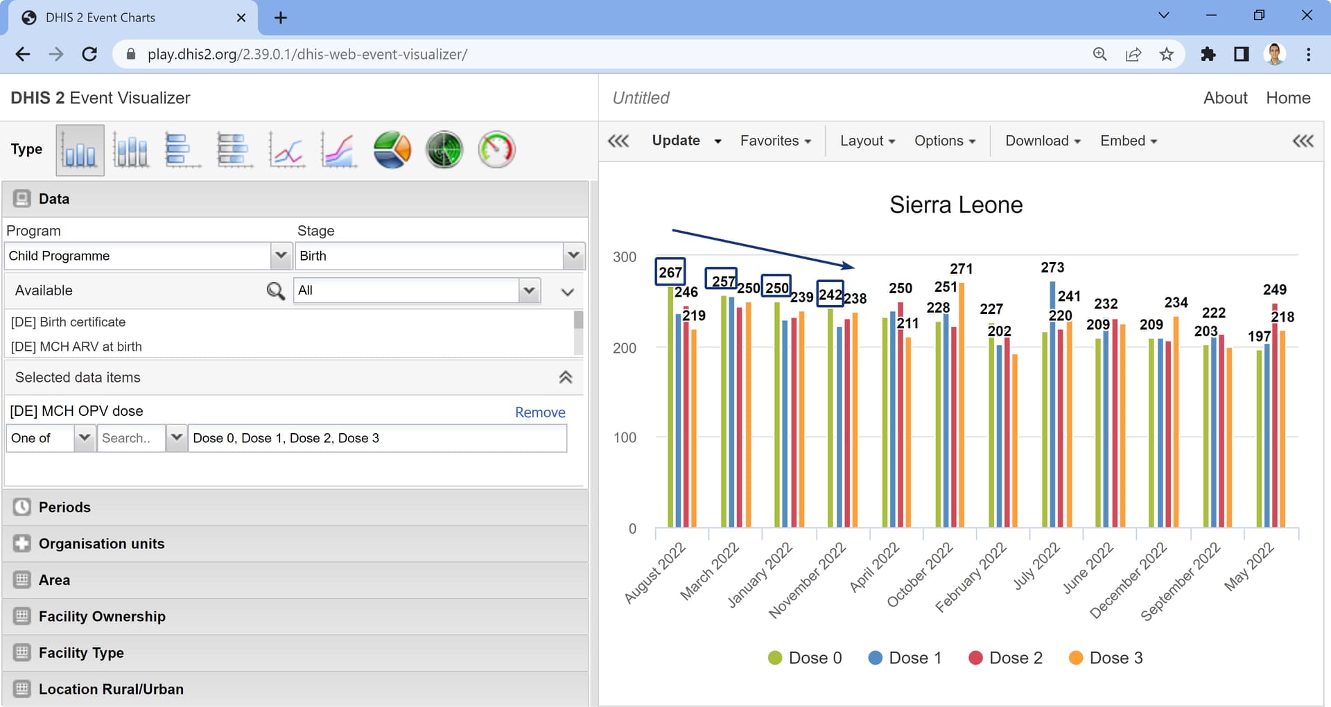
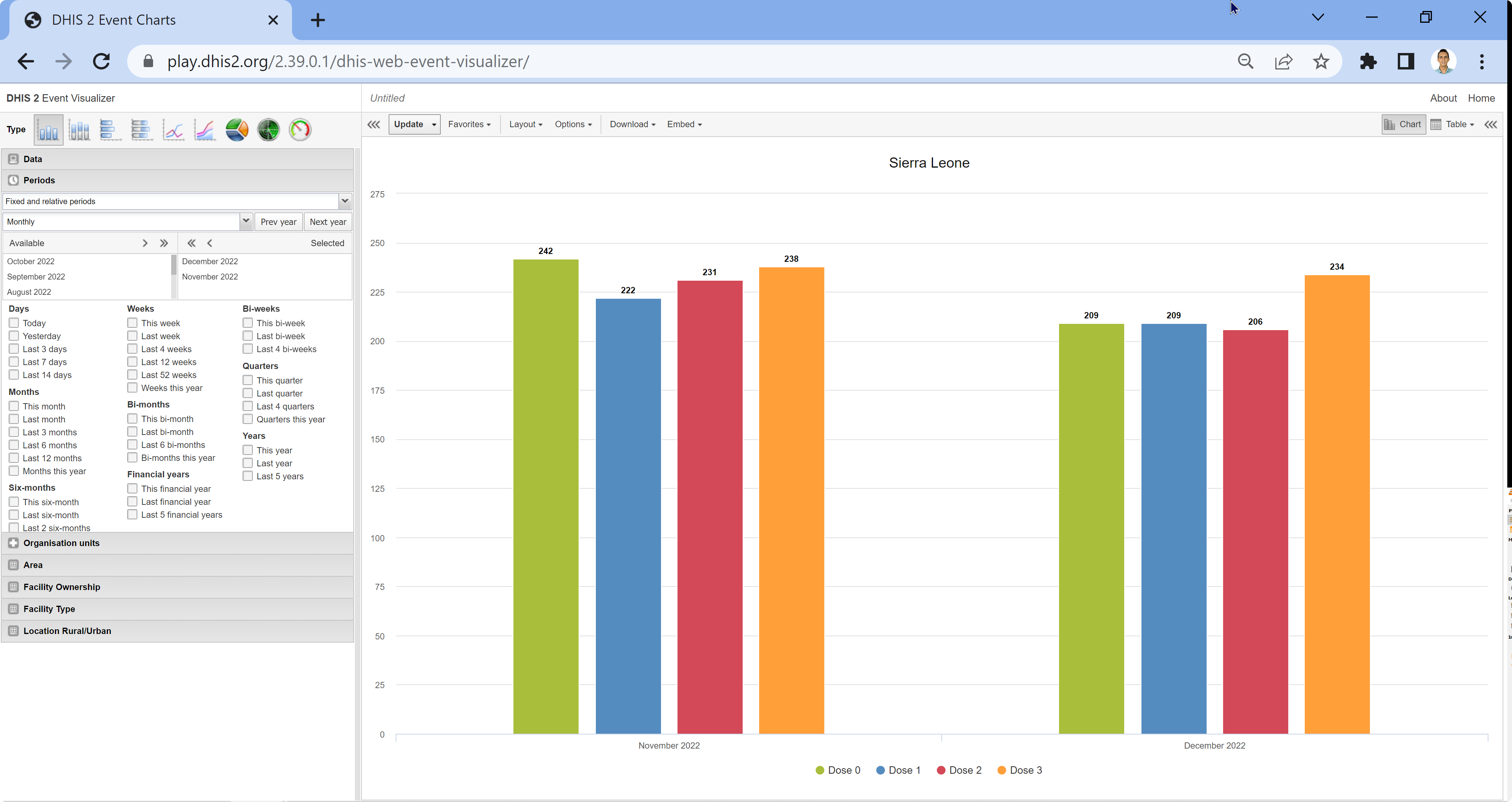
It seems that the sorting would be for the first value in the series. It’s how the sorting is done but it’s not visible in the first screenshot you posted because it’s grouped by year. If you change it to monthly and sort high to low it will order based on the first option in the series (Dose 0) but will not sort the series. See the screenshot below:
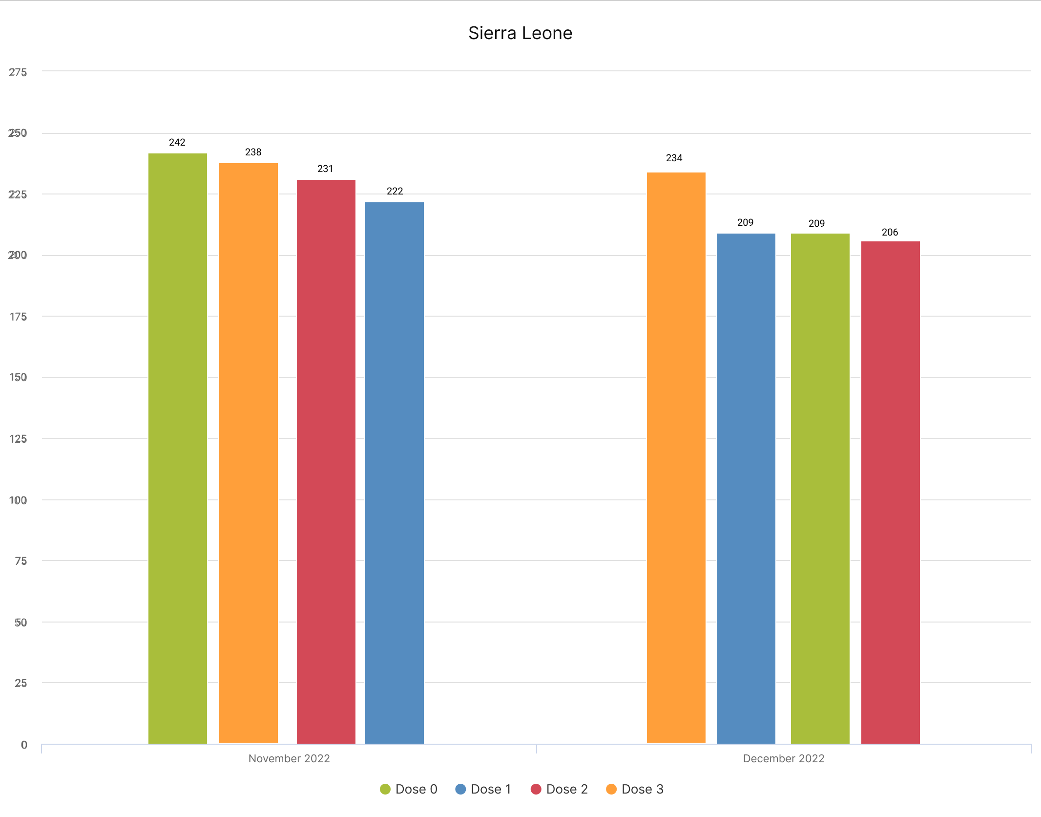
The sorting when there is an option set will always sort based on the first value of the option set but will not sort the option set. This becomes more clear when the period is changed to monthly, but also if we have several years, the sorting will be based on the first option in the option set.
This explains why this was sorted from high to low.
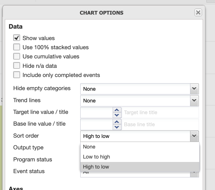
@Ulanbek, initially this is not a bug; however, we can change it to a feature request? But it seems that this gets complicated and needs more discussion. For example, in the screenshot below:
Thank you for your attempt to help. The thing is @Gassim I need this chart for single year or month, without comparing few years or months between.
Yes, if you compare them it works, but inside single year, it sorts only by the name of options or put based on options sortOrder property.
Let’s wait what analytics group can propose for us
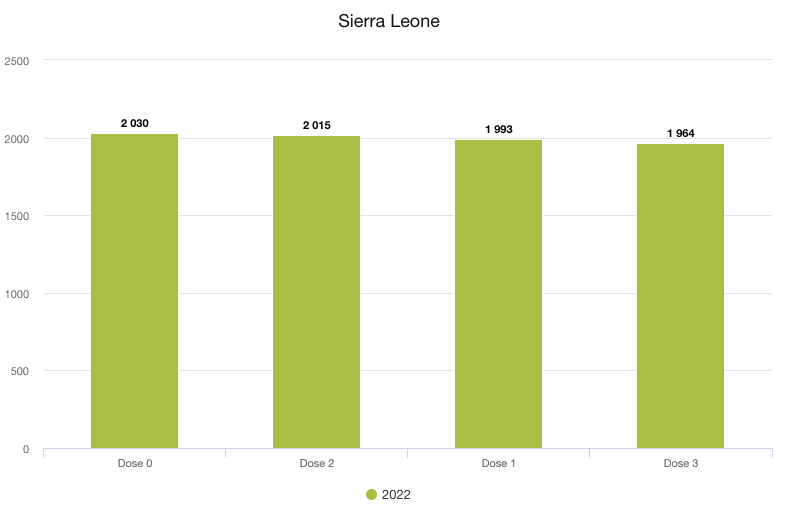
if the colors are not important, he could of course swap series/category and then sort high to low, so that there’s just one series dimension and multiple categories
Thank you for your interesting solution. Yes, this can be used for now as a solution of the problem, but anyway would be great if analytics group could make the charts more flexible. Let’s wait.