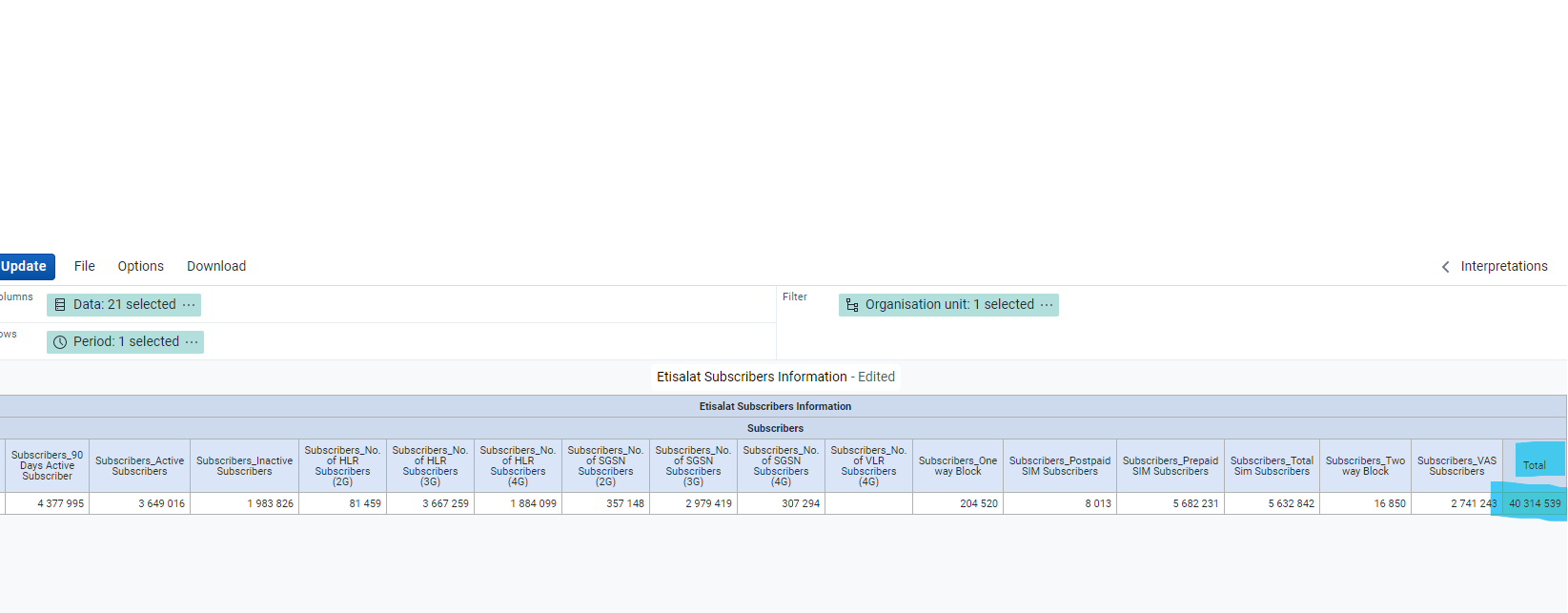
I hope this message finds you well, the data visualizer is much better from previous version. it will be much better if the same pivot table design download in excel or csv and the subtotal or grand total is also not downloaded in excel , csv and html
if possible to add pivot table with charts combine in one page. looks better. hope it is added in next release of dhis2. much better and appreciated.
With best Regards
Mohammad Ayub Yousafzai
Kabul , Afghanistan
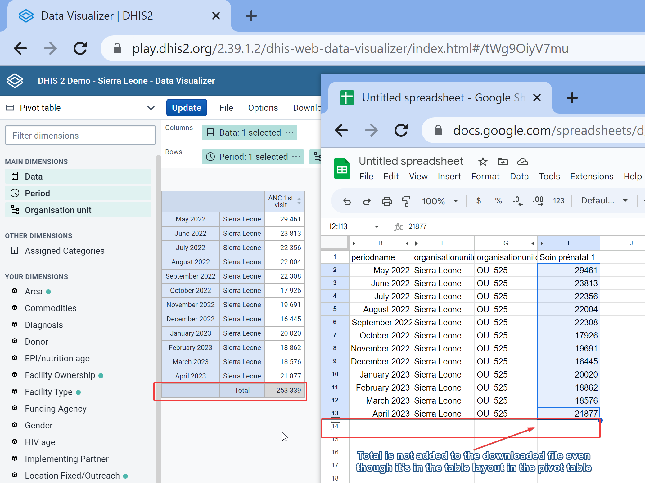
I hope this message finds you well, my main purpose is to download the same format pivot table with total in excel but it is not downloading the same format but it leave total.
if possible to show data in table and charts in one file. it will be much better.
My Suggestion was that as well as two more suggestions for the betterment of the system.
1- Increase some more Formatting , download with the same format to excel.
2- we are able to show data in pivot table as well as in charts in the same file and download to excel and pdf.
It’d be interesting if it’s possible for the xls file to have an already generated chart. Would you like to create a feature request for this option? Projects - Jira However, it might be something that requires a lot of maintenance, so for now, any spreadsheet software that can use the xls file should be able to generate the chart from the data.
This is already an option in Image or PDF but in excel, you’d need to generate the chart from the plain data source. It sounds similar to the request above.
Thank you for your consideration, I mean customly adding labels , logos , like power bi desktop at least some features, if possible.
to create a good report and download with same format in pdf and excel.
it will be more attractive.
Regards
Mohammad Ayub Yousafzai
Kabul , Afghanistan
Thank you for the clarification! Would you like to create a feature request and share the link to the ticket here so other community members can vote/watch/comment and follow? Projects - Jira