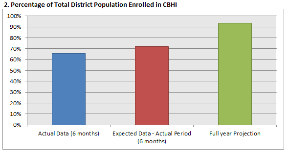
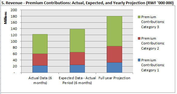
Before trying to re-invent the wheel, I wonder if anyone has experience creating charts and tables based on projected data in DHIS-2. We have developed some data sets for community-based health information that takes data reported monthly and projects it forward to the end of the financial year. For example revenues from co-payments and enrollment fees for 3 months – is projected ahead 6 months and one year – using a variety of assumptions.
I can see 3 options:
Develop an algorithm that runs at the end of each quarter and inserts the projected values into datavalue table so that we can use DHIS-2 analytical tools to create charts, tables and maps. (I think Jason Pickering has done something like this using R)
Design queries and custom tables to store the projected values and build iReports with charts and tables.
Extract the data from DHIS-2 into Excel (where the current analysis tools have been developed) and continue to use Excel for the visualization.
Here are some sample outputs:
If you have other suggestion they are most welcome.
Randy Wilson
Senior HMIS and Data Use Advisor, Ministry of Health/Rwanda
On Mon, May 5, 2014 at 11:58 AM, Wilson,Randy rwilson@msh.org wrote:
Before trying to re-invent the wheel, I wonder if anyone has experience creating charts and tables based on projected data in DHIS-2. We have developed some data sets for community-based health information that takes data reported monthly and projects it forward to the end of the financial year. For example revenues from co-payments and enrollment fees for 3 months – is projected ahead 6 months and one year – using a variety of assumptions.
I can see 3 options:
Develop an algorithm that runs at the end of each quarter and inserts the projected values into datavalue table so that we can use DHIS-2 analytical tools to create charts, tables and maps. (I think Jason Pickering has done something like this using R)
Design queries and custom tables to store the projected values and build iReports with charts and tables.
Extract the data from DHIS-2 into Excel (where the current analysis tools have been developed) and continue to use Excel for the visualization.
Here are some sample outputs:
If you have other suggestion they are most welcome.
Randy Wilson
Senior HMIS and Data Use Advisor, Ministry of Health/Rwanda