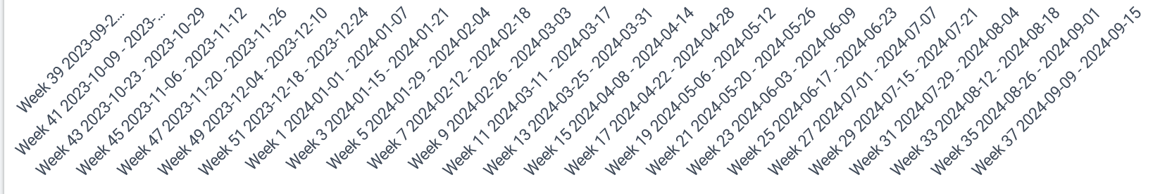
Is there a way to display shortened week labels in a visualization? Dashboards become quite cluttered when displaying multiple weekly time series with the default lables.
Ideally I would like to truncate the lables such that they only display “Week 1 2024”, “Week 2 2024” etc. and not the full date range. Are there any style options for this?
Thank you for your feedback. There doesn’t seem to be an option to modify the period formatting; however, I will share your post with the functional-design team.
Additionally, you could create a feature request in and share it so other community members can provide insights and add their comments (see ideas).
Hi! Just adding support for this request We hope it gets picked up from the roadmap.
We would like the previous week labels back (W10 2026) or at least another short version. All of the actual data in our weekly charts is very difficult to read with such long labels. In addition, for some weeks, the label ends up getting cut so the more precise information provided by this new style of label is not even visible!