Hi
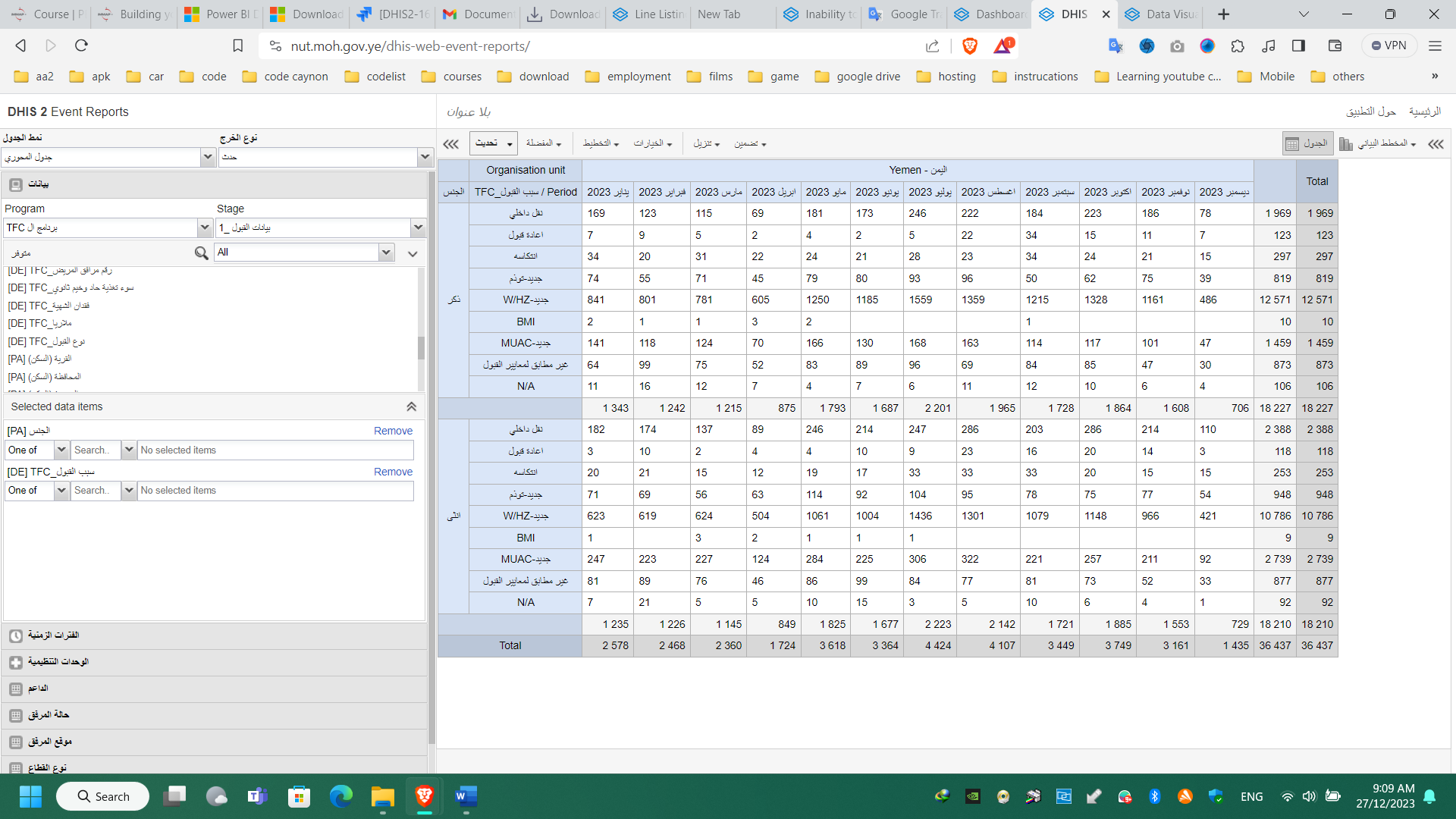
In earlier topics we knew that the event report app is stopped developing and the line listing app is instead of it but in the event report there was pivot table and there is
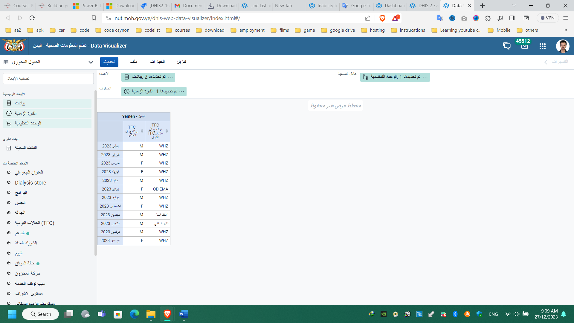
to it even in the data visualizer app . attached two photos explains the difference between the two apps.
When creating the Pivot Table in the Data Visualizer app, you have the option to select the disaggregation to be either details or totals. Currently, in the screenshot you shared from the Data Visualizer app, it appears that the selection is for total; however, to make the disaggregation appear similar to the one in the Event Reports app, please select ‘Details only’ when selecting the Data Element.
if trying to visualize event data, the option of disaggregation does not appear. I tried this as an option to not having a way to visualize events in pivot table format.
@Gassim In the 1st screenshot shared by @Eng.Ali_Hameed, two data elements (I will name as DE1 and DE2) are selected. Event Reports (pivot) then disaggregates the events (rows, in this example) by disaggregating the values for DE2 within each value of DE1. This is similar to how pivot table works in Excel. Currently, DHIS2 Data Visualizer (pivot table) cannot do this (as you noted, one would need to select Details, but that would only show the catoptions on that DE). I think this is more of a feature request for Data Visualizer (or somehow retain that functionality within Event Reports or add into the new Line List app since Event Reports will be discontinued).