The UiO analytics development team is getting ready to start development on a new pivot table app to replace the current pivot table app. This new app will have a much improved and more intuitive user experience. It will also include enhanced functionality for drill down, scorecards, league tables, and progress indicators.
We invite you to have a look at the current interactive mock-up here:
Love the improved features on this app. Haven’t tested them all. A few suggestions:
Options > Reset Title of table every time an update is made OR warning to check title since table content has been changed.
Options > Title: Have list of key words for ‘Data, Periods, Org unit’ selected to facilitate quick, consistent, standardised, title change.
Download > Allow for ‘Image’ and ‘PDF’ options of tables, just as in Data Viz, for easier use (for example, in external reporting)
Data > Allow for 2 indicators to be assigned as ‘numerator’ and ‘denominator’ so percentages, proportions, rates are automated on the table. For example, ANC 1st visit (numerator), Total ANC visits (denominator), Automated percentage of First ANC visits (third column)
Data > Just as in Event reports, prefix to DATA items to indicate whether DE, PI, Ind or Prog Agg Indicator.
"Not sure whether this is already scheduled, but in case it’s not: it would be really useful to have more flexibility in selecting relative periods in pivot tables and other analytics modules.
Rather than being restricted by specific relative periods (e.g. last 12 months), having the user specify a combination of period type and number of periods will allow for covering all possible relative periods: “Last [x] [period type]” whereby [x] is entered by the user and [period type] is selected from a drop-down. For instance, i can then generate a table with data for the last 9 months as relative period, which is currently not possible. Separate parameters will be required to select current period (today/this week/this month etc.) and “periods this year”"
Hi there,
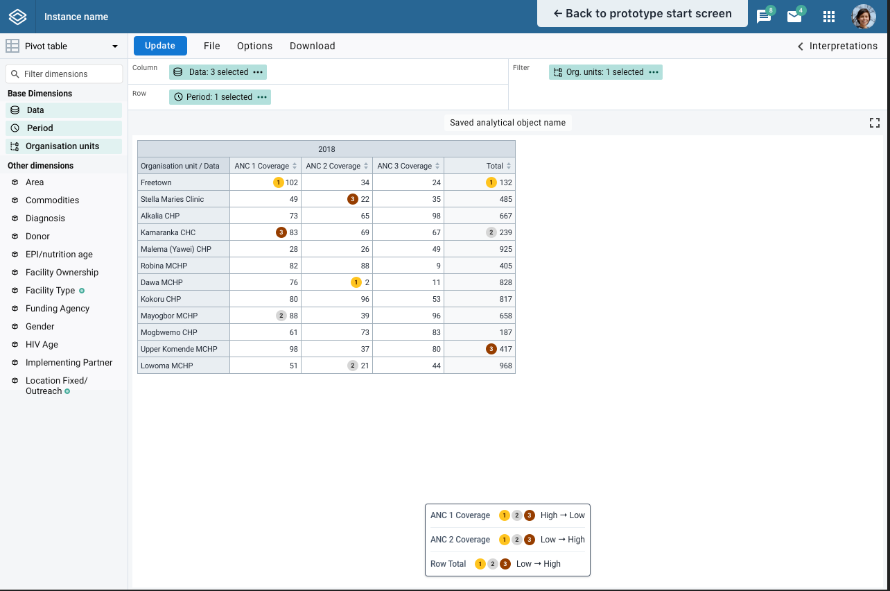
Looking good! Any chance there can be a ‘colour gradient’ option added for cells (e.g. red for high values, yellow for low) a bit like the options in Excel, the Conditional Formatting section? I’ve found users to like them to get a quick overview of the data.
Cheers
Hi Damien, thank you for your feedback. Yes, that will be included in the new application. Also, applying legend is already available in the current pivot table application under the options menu.
Hi Scott - users still see a lot of non-numeric data elements appear in the list options for Data Elements and Event Data Items - can this be addressed in the new pivot table app? Data that is not numeric and does not fit the Pivot Table model should ideally be excluded from the list of options (option sets, text, yes/no)
Hi team, this question about pivot table functionality is related to a question I have been wanting to ask for some time: When other organizations collect and share non-numeric data in DHIS2, what are different methods which are used?
We are using a data-collection tool that collects a combination of numerical KPI data and qualitative answer responses (Yes, No, I don’t know) and free-text responses. Even if this data can not be displayed in Pivot Table format, are there some methods that could reliably indicate how often these questions are being answered, which would serve as a prompt to go in and download this data for external analysis?
@Mike_Johnson and @Sameen_Babur thank you for these suggestions. Yes, we are planning to better support option set aggregations and display similar to what is done in event reports app in which the count for each options are displayed. Right now (<=2.32) you can aggregate a options using a predictor, but this is a little cumbersome and somewhat technical, when ideally the option counts should easily be rendered just as any other data element value type.
If you would like to know more about how to create a predictor that aggregates a option check out this link to the user docs, and let me know if you have any questions. Home - DHIS2 Documentation