A casual conversation - I personally liked legacy app icons more than 2.40.
Is it just a my preference alone? or there are many who thinks the same way?
A casual conversation - I personally liked legacy app icons more than 2.40.
Is it just a my preference alone? or there are many who thinks the same way?
Hi @jthomas
I moved the topic from the support to the implementation category. I hope you agree with me! ![]()
Thanks for opening this topic discussion. My personal opinion is that when it comes to themes and style, the results will always be diverse and different. Which icons do think are better?
For example, in my perspective the new icon for the Data Entry app (in beta) is much better than the legacy one:
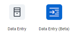
I feel that the new icon is more meaningful and looks nicer too! ![]()
Thanks @gassim
Yes may be because i was so used to it, generally i somehow fond of pre 2.40 version icons, defenitely data entry beta is better than data data entry 2.40
Sure, familiarity with the previous icons probably is a reason you’d prefer them. Do you think it’d be possible to use the styles.css to update those icons? If so, would you do it?
I think it’s always to have different options when it comes to themes and icons. ![]()
Super idea, if there was an option to chose icon styles, i would go for it for sure.
I, for one, prefer the pre 2.40 version! Great to see that the icons are undergoing continuous improvements, such as the beta data entry. Having an option to choose icon styles would be great.
Wanted to share this awesome news here too:
Yaaay @Gassim ![]()
![]()
