I want to understand how Totals are calculated when visualizing data using pivot tables:
Disclaimer: The data dimensions selected in the given images might not make sense, but this will help me to understand how DHIS2 come up with the row-totals, row-subtotals, likewise the columns.
This output is from DHIS2 play instance version 2.40
Below are two images that outputs totals.
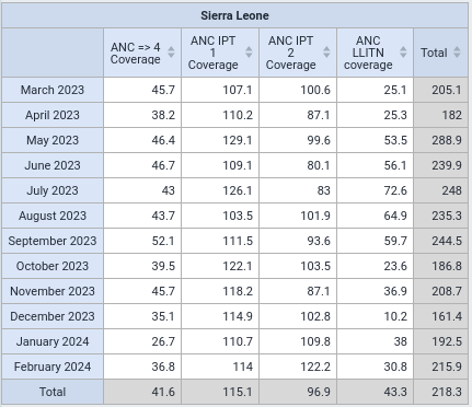
First Image
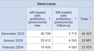
The second image Output
Thank you.
1 Like
Hi Bernard,
I’m on a flight, so only using my phone (and can’t easily see the construction of the indicators involved), but DHIS2 normally calculates numerator and denominator, then divides the former by the latter. So my guess is that the “total” simply adds up the sum of all numerators and divides this by the sum of all denominators.
Since some of these indicators presumably use the same denominator, that data will only be counted once when the total data is summed (even if it was re-used again in two or more columns), so the “sum” of the denominators will be undercounted, leading to the inflation of the coverage percentage.
This is just a guess - can you check it?
Cheers, Sam.
i manually added the data source, the way you advised, summation of all numerators for each indicator and summation of all denominators for all indicators, then i multiplied the proportion by 100 to get the percentage if it is a percentage indicator.
NOTE: I did not come across the situation where the same denominator is used for all multiple indicators.
Thank you @SamuelJohnson
Hi Bernard,
I’m back on my laptop, and have just checked: as I suspected, although the second and fourth indicators both use different numerators, they do in fact use the same denominator (“Soin prénatal 1 Fixed” + “Soin prénatal 1 Outreach”).
So when DHIS2 adds up the four indicators, it will sum the four numerators, but will only sum 3 denominators (as it will count the denominator for indicators 2 and 4 only once, despite the fact that it’s used in two columns), so the denominator will be smaller - and the coverage percentage will therefore be higher than the average of the four indicators.
Thanks for raising this point - I hadn’t noticed this effect before. I think the lesson to take away here is that we shouldn’t “total” different coverages. 
1 Like
Yes, we shouldn’t sum them, but we have to understand the reason why the core team in Oslo implemented the logic of summing the coverage indicators.