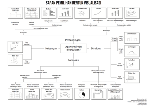
Choosing the right visualization or chart type is important. Research has shown that a majority of dashboards suffer from “Visualization Technique Problem”. This is often a problem of using the wrong chart type for the data. This makes a dashboard and its information difficult to understand. A dashboard that does not communicate its data is not useful.
At DHIS2 we want to help users to create understandable data visualizations. We have been discussing ways we would help users select appropriate chart types for their data. We would like to ask you, the DHIS2 community, for feedback on our ideas.
Concept
Display recommendations for visualization/chart type in Data Visualizer app. Recommendations can be both generic and based on the user’s selected data.
Generic recommendations
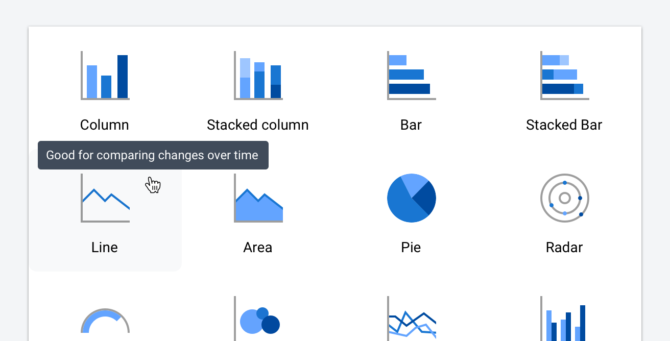
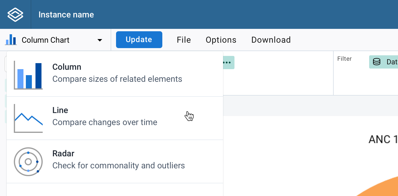
Display help text alongside chart types. This text should give a short, understandable summary of suitable uses cases.
Displaying the help text as a tooltip (design mockup):
Displaying the help text in the chart selection menu (design mockup):
Possible downsides:
- All use cases for a chart type will be difficult to communicate in short help text. Users may worry that anything other than what is listed in the help text is invalid. This is not the case.
Recommendations based on data
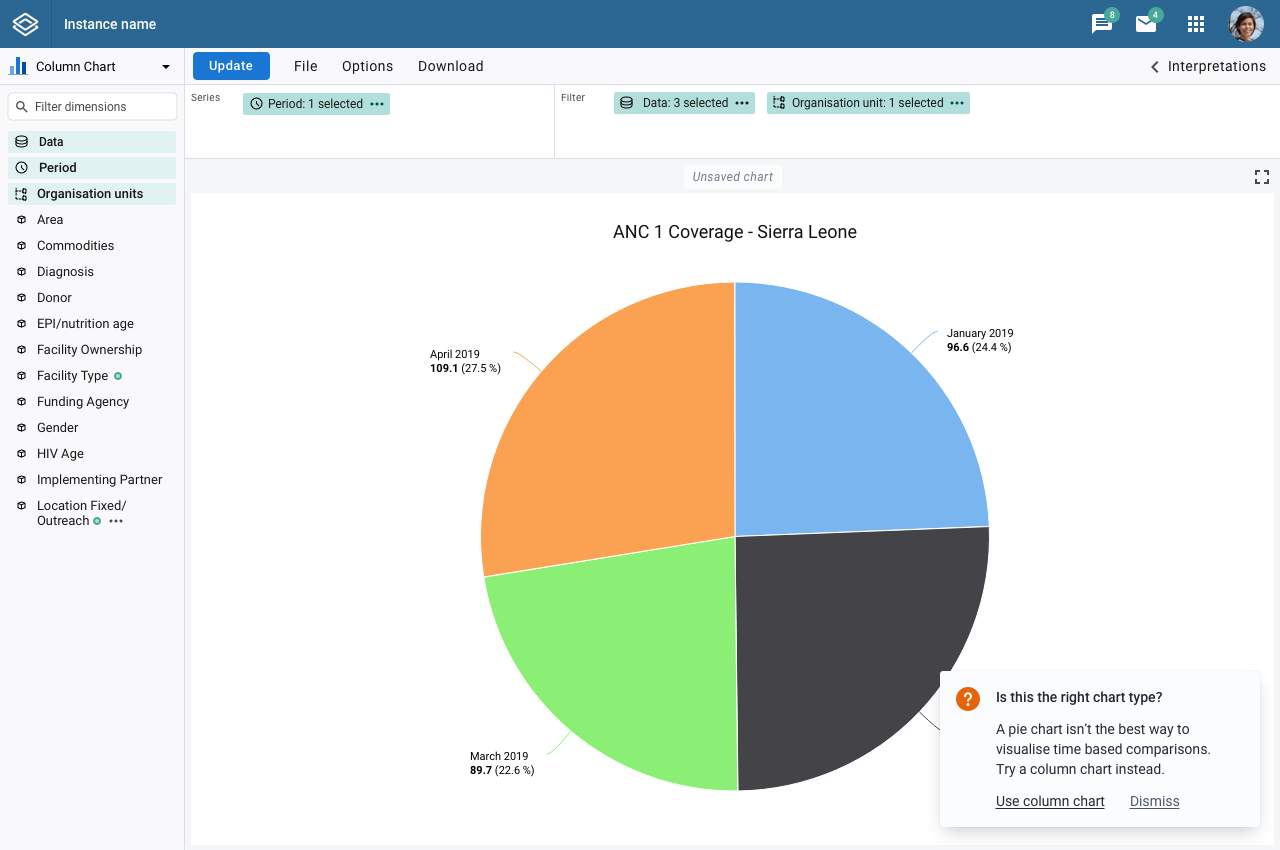
Display help text/messages when DHIS2 detects that the selected chart type may not be suited to the chart data. For example, if a pie chart is chosen with the time dimension as series. DHIS2 can inform the user that pie charts are not ideal for comparing data over time and can instead recommend a column or line chart. These messages can be dismissed without taking action. They could also be disabled in user settings.
Displaying a recommendation message based on selected data and chart type (design mockup):
Possible downsides:
-
The system must always give correct recommendations. If an incorrect recommendation is given the user will lose trust in all future messages.
-
May be difficult to implement for complex data selections.
Feedback
We value your feedback. What do you think of these potential features?
-
Do you think they would be helpful to you, or others you have worked with?
-
What might be more helpful, generic recommendations for choosing a chart or specific charts based on your data?
-
Are there any resources you use today to help select the correct chart for your data?
-
What other common data visualization mistakes do you see?
-
Any other feedback or suggestions for how we can help users create valid, understandable data visualizations?
Thank you for your time!
Joe Cooper
DHIS2 User Experience Designer