Dear Community,
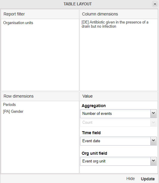
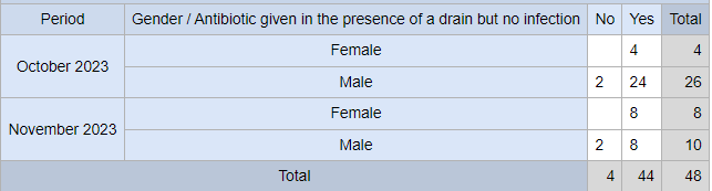
I am trying to generate a Pivot Table using the Data Visualizer on the data elements of a tracker program the same way the old Event Reports App used to produce the Pivot Tables as shown below where one data element is on the row dimension and the other data element you are comparing is on the column dimension.
The Gender can be added as a custom dimension added to the Rows in the table here it’s Rural/Urban but yours will me Female/Male. The OU should be moved to the Filter, the Data where the disaggregation (details only) should be selected rather than (totals only) and in this table ANC 1st visit Fixed and ANC 1st visit Outreach are whereas in your table it’s No/Yes. I didn’t add the Total but that can be added from the options.
I recommend going through the DHIS2 Analytics Tools Academy - 2021 Q2:
Additionally, although this video is using a legacy app, it provides an explanation to these additional dimensions and how they’re configured so I believe it will be helpful: