Hello Team
Hope you are doing well,
Please can you share experience on how to addnew ou update colorset for Stacked Column Graph ?
DHIS 2.36.12 (Build revision b6d3754)
Sincerely,
https://play.dhis2.org/2.36.12/dhis-web-data-visualizer/#/NjK24B1oGYF
Hello Team
Hope you are doing well,
Please can you share experience on how to addnew ou update colorset for Stacked Column Graph ?
DHIS 2.36.12 (Build revision b6d3754)
Sincerely,
https://play.dhis2.org/2.36.12/dhis-web-data-visualizer/#/NjK24B1oGYF
Hi, welcome back!
I don’t think this is possible directly on the app. However, it’d be great if you’d like to write about the use case and why such a feature is important.
Please feel free to create a feature request here and share it in the community so other members could vote/watch.
Thank you!
Dear @Gassim
Thank for your quick answer,
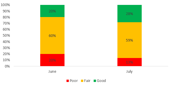
For performance follow-up we want to categorize for each month of reporting and for a specific indicator, the percentage of health facilities with 03 traffic light (colors) : Poor in RED, Fair in YELLOW, Good in GREEN. Below an example in Excel
Sincerely,
Dear community,
Here is the feature request LINK for #Changing Colorset in Stacked Column Graph
Please watch and vote for it ![]()
This feature has been implemented and topic solved. If you have specific questions about this feature and believe this topic should be opened please send a message to moderators; otherwise, please create a new topic post.
Thanks!


