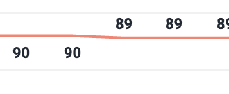
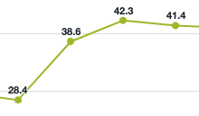
I have tried to recreate the second chart with the visible points but my guess is that the chart is not from a DHIS2 instance (right?) because the points only become visible when highlighting.
This is another design/UX feature request… would you like to create a feature request using your Jira account? I can create one on your behalf using mine if you want…
Having visible points helps show the chart is not empty in instances where there is only 1 data point.
Currently if I have a single value along the x axis, it can appear like the chart is broken as there is no node/point shown. A line only appears when there is 2 or more nodes/points on the chart.