How to plot the data visualization, as site specific, i need to show only the site specific dashboard,but have assigned all the organization unit to the site for search and analytics.
The dashboard favorites show the latest updated site statistics then own site.
2 Likes
One way of achieving this is to use “user organisation unit” in the graphs and then based on user assignment the will see only their respective sites/org unit
1 Like
There is no doubt, i have assigned user organization unit, i have assigned top organisation unit as the analytics and search.Still i see the same.
1 Like
It’s not clear what you want to achieve exactly? You can select the required OU from the OU hierarchy your user has access to, but it seems you are already doing that but what’s the issue? Would you please take a screenshot to explain further.
Thank you!
1 Like
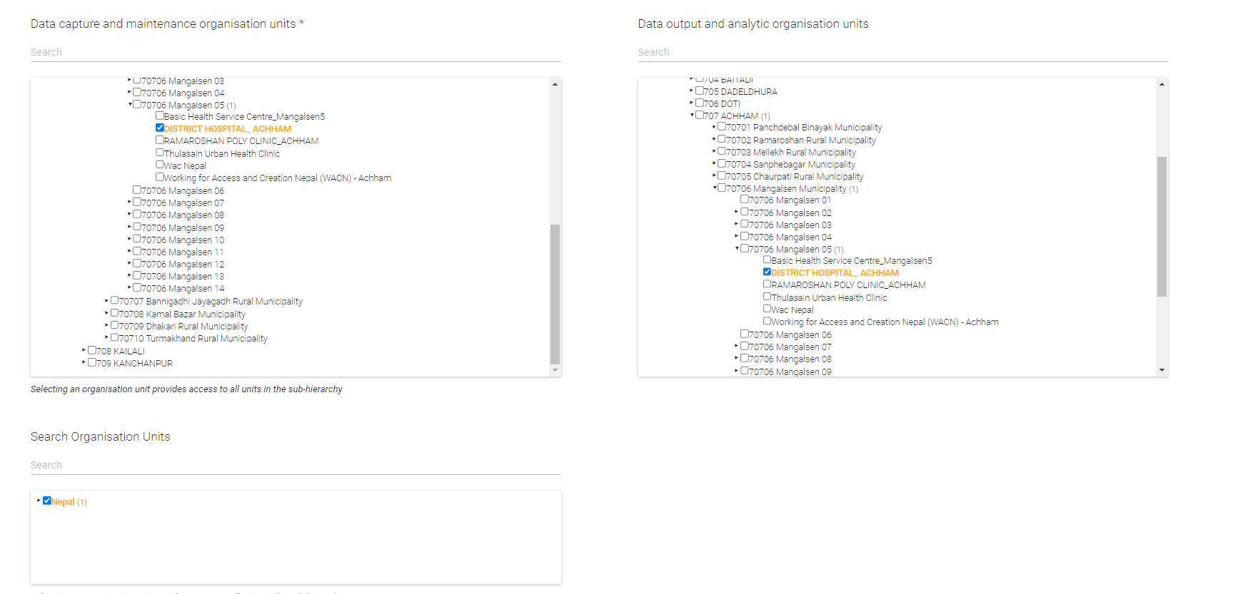
There are some tweaks made on organization in user privilege while capture and Data Output i have assigned the health facility and for search i have assigned National Level.So while loading dashboard by health facility level.It shows other health facility status graph.
1 Like
Could you add a screenshot please? Or steps to reproduce this on any of the play instances? Thank you!
1 Like
@Gassim thank you for your interest.
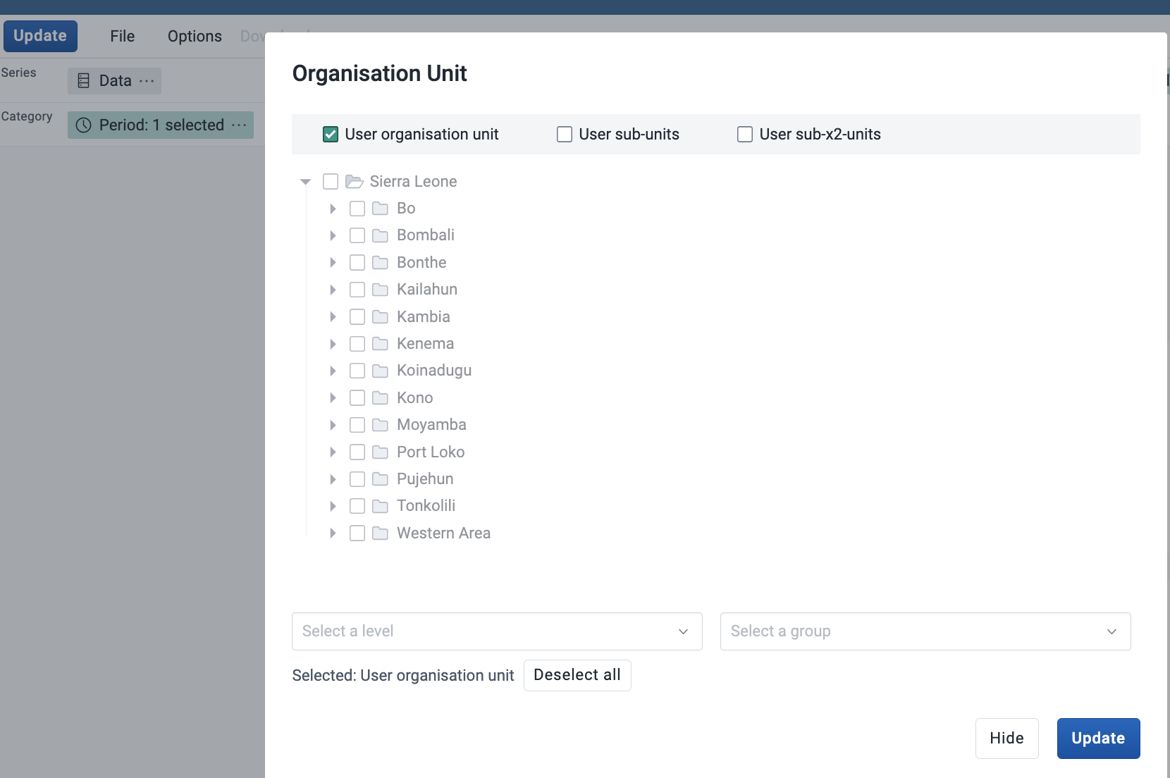
I have assigned user roles as below for “A” user
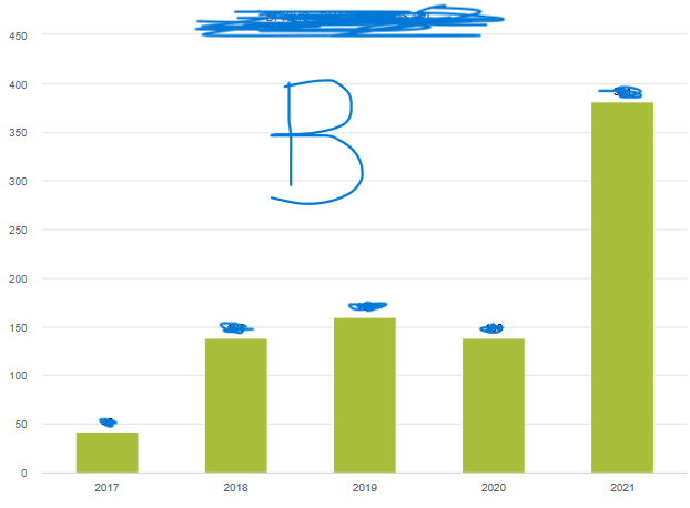
When " B" user which belongs to another health facility loads the dashboard, it shows likes
My concern is that “when B users check dashboard it should show only related to B organization unit users should not show “A” organization unit user graphs.”
Any solution to this case to make the dashboard user and organization unit specific?
NOTE:I have save the favorites as user organization unit.
1 Like
Sorry for the late response! I can’t reproduce this issue. Please try to clear your browser cache.
If you still see this issue please include the steps to reproduce this on a play.dhis2.org instance, thanks!
1 Like